
In December 2017, Outward partnered with The North Face to create two web experiences for backpacks and tents, which would combine the client’s image content with our interactive 360 technology.
For the pilot, I was asked to design a product page experience that allows users to view packs and tents in 360 degrees. Our hypothesis: by providing a consumer with a more holistic view of a product's features, the consumer is more informed, more confident, and therefore more incentivized to buy.
Web App
UX & Product Design, Copywriting, Photo Editing
December 2017 — February 2018
This was my first project at Outward where the client gave us full authority to visualize an idea from ground up. I dove in, examining the client-provided materials -- a set of image frames and a sheet enumerating products and desired detail shots -- and scouring the internet for competitor experiences, the best of which was Osprey’s backpack featurette. Osprey’s experience was clean and interesting, with a 360 view of the pack's exterior and crisp closeups, but it also fell somewhat short with its minimal feature highlights, nonoptimal rotation settings, and little explanatory detail. I wanted our North Face experience to do more.
Armed with my preliminary market research, I conducted a card sorting exercise to identify patterns amongst backpack features, followed by whiteboarding and sketching to ideate on the interface layout, triangulating on how to best emulate what a backpacker would look at while shopping in an actual store. The resulting design set forth a baseline experience within the existing product page.
Take a look at my early card sorting, whiteboarding, and sketching ⇲
Intuition plays a big role in creating the ideal design, but I knew I needed to test my feature categorization and uncover more of what I didn’t know. Without a sanctioned research budget or other company resources, I reached out to an avid camper friend to conduct an informal interview, using a script prepared in advance.
During the session, we discussed his experiences with camping, purchasing equipment online versus in-store, and purchase considerations, followed by usability tests of Osprey’s 360 feature and my prototype. I saw a clear pattern of thought that validated my design: whether he was buying camping equipment online or in store, his mental calculus covered distinct categories like accessibility, functionality, or weight. Moreover, visualizing how items fit (not just how the pack’s features look) -- like a tent or ground pad, which attach to the exterior -- was more important than simply seeing where a granola bar can be slipped into a pocket.

Following the interview session, the design for the backpack experience underwent a few reviews and iterations. I edited and removed categories, switched the category order, and included mouseover zoom for the detail close-ups. I cropped and processed the final detail shots in Photoshop. After some back and forth with the client, I also took charge of writing the marketing copy for the detailed feature descriptions, emphasizing the feature purpose to better educate the user.
Stakeholders ultimately chose to remove the category filters to minimize disruption to the existing product page; they also decided to place the 360 experience within a modal (and then reversed course upon final integration). Although I personally didn’t think these choices were the best for usability, I put extra efforts into editing the feature descriptions to maximize clarity and also into ensuring that mobile responsiveness was optimized.

I wrapped up the design for the project with a detailed design specification guide and worked with the frontend developer across several weeks to implement and refine, frequently pairing to tweak styling or explore microinteractions, feeding off of each others' curiosity and creativity, challenging each others' reasoning, ultimately building a collaborative relationship that would last beyond this project.
Have a peek at how I outlined some interactions and responsive behavior ⇲
For our North Face tent experience, the client asked us to provide the same 360-degree view of the product exterior, while also adding a 180-degree view of the interior. Inspired by my earlier interview with my camper friend, I wanted my design to somehow simulate the feeling of walking around a tent, lifting the door flap, and stepping inside for a warm place to sleep.
My early iterations reflect some of my challenges in figuring out a way to bridge the inside and out. Incorporating the interior experience with the hero section minimized disruption to the existing product page structure, but it also confined the image to a square, making the tent interior appear small and cramped. Moving the interior experience into its own special section gave the content more room to breathe, but risked either being too similar to other page components and therefore overlooked, or too different from surrounding page components and therefore poorly integrated.
See my iterative concepts in high-fidelity ⇲

It was only when I thought of applying the idea of night versus day that I zeroed in upon my desired concept: by giving the interior experience its own spotlight and placing it against a dramatic, dark background, I sought to digitally replicate the physical environment of outdoor camping on a evening night, using a sensory trigger to pull users in and capture their interest. When I was later asked to adapt the experience to fit within a modal, I found that I could amplify the experience even further by letting users toggle between the interior and exterior views, like they were stepping in and out of the tent.
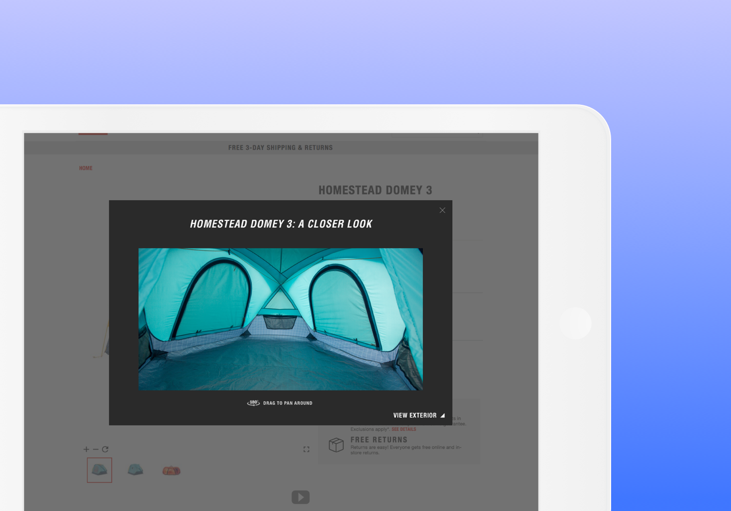
With time running low ahead of the pilot launch, I was asked to produce the final content for the tents' interior shots. Together with the frontend developer on the project (who does photography on the side), we spent an afternoon pitching a tent in the office, setting up camera stands and lightboxes, and shooting the interior, after which I processed the images on Photoshop. It felt refreshing to step out of our comfort zones, and I enjoyed every minute of it (and we might’ve left the tent standing indoors for more than a few weeks after that).
The pilot went live in April 2018 and lasted for several months. I loved the opportunity to work with the distinguished American outdoor recreation product company, and I carried my experiences from working on this project into informing my methods and practices on larger projects later on, most notably for Williams-Sonoma’s Room Planner.
